Crunching OSM data with Ohsome Dashboard
Hi and thanks for reading another OSM Tip!
I love crunching OSM data. Discover what the community is mapping and where. Historical trends. The Oshsome Dashboard makes this accessible to anyone! You can create interesting charts like this one in minutes:
|
|
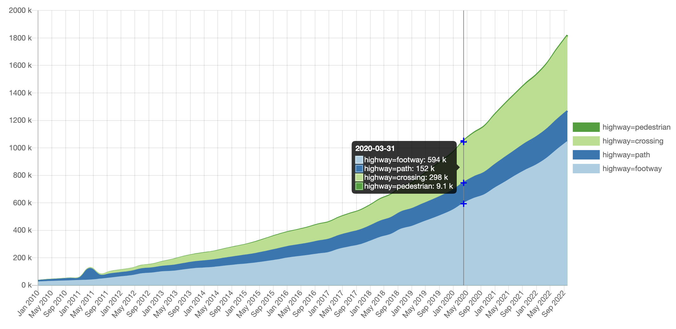
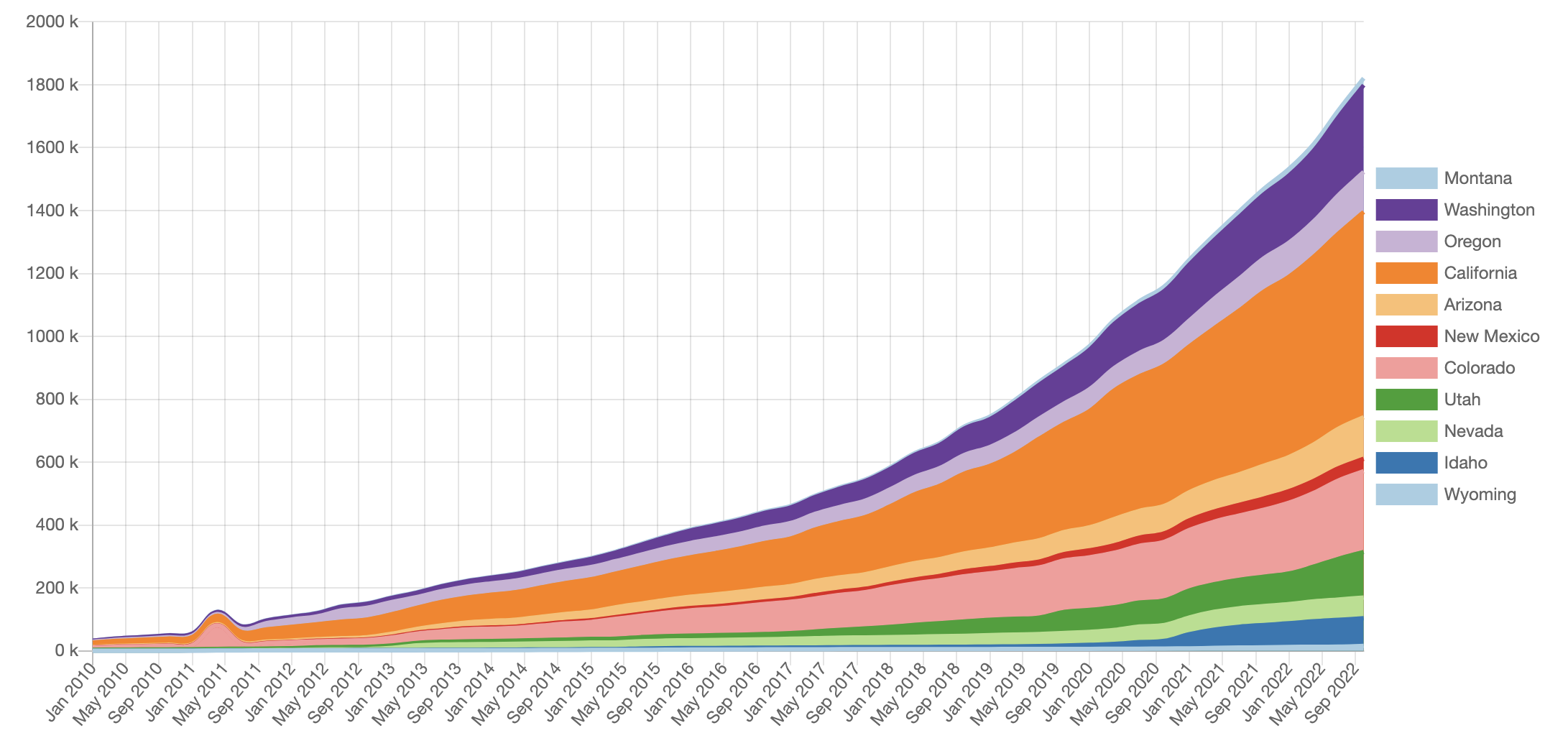
This depicts the growth of some pedestrian related infrastructure mapped in OSM in the Mountain and Western US States since 2010 grouped by tag and by state. Let me show you how to make something like this.
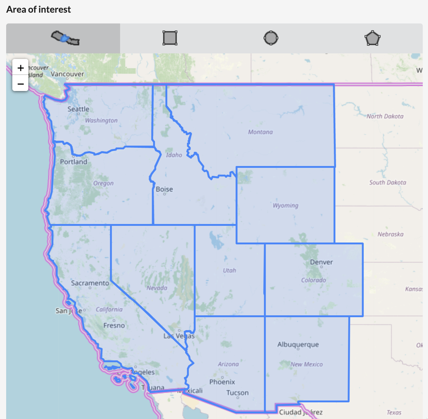
First head to the dashboard. In the Area of Interest map, select the area(s) you are interested in. When zoomed out, it will show countries, but if you zoom in, it will show states / provinces. I selected some U.S. states:
|
Next focus on the Filter section. The Simple view lets you select one OSM tag and one OSM type (node, way, relation). You can do more advanced selections using the Advanced tab. The syntax for the filter query is documented here. I used:
highway in (pedestrian, footway, path, crossing)
to include everything with the highway=pedestrian, footway, path or crossing tags.
Then, look at the Group Results By.. section. I ran the analysis twice: once by boundary and once by tag, to get both the charts.

|
The last thing to potentially tweak is the date range and interval for the analysis. The longer the date range and the more granular the frequency, the longer this is going to take.
Next, run it and enjoy your results! You can export the data as CSV or JSON. Unfortunately you can't export the charts as image files, but you can take a screenshot (which is what I did.)
Let me know how you use Ohsome Dashboard. Happy Mapping!
Martijn
Thanks for reading the OSM Tips Newsletter! I would love to get your feedback. If this email was forwarded to you and you would like to subscribe yourself, you can do so here.